What I can do _ Design
Graphic
Studio P.I.|Re:License|P.S|theUtopium|ProjectComingOut|UD2.0|LittleDesignSolution|SchoolOf|#CycSatellites
Graphic design: from calligraphy to a brand’s visual language
Listen — Graphic Design|聆聽 5:28
Her approach to graphic design grew out of an interest in calligraphy, lettering and type that developed during her education in the late 1990s and around the millennium. Painting, surface design and the act of writing gradually became connected parts of her practice. A letter could be a readable sign, a repeated motif, a material gesture or the beginning of a brand’s identity.
Learning to look at the writing instrument
In Italy, her early training centred on traditional academic painting and drawing. One exercise introduced her to a pointed bamboo pen dipped in ink and used on sketch paper. Coming from Chinese brush calligraphy, she was struck by the difference: bamboo could hold a soft, pointed brush, but it could also become the hard point that made the mark itself. Changing the tip changed the movement of the hand and the character of the line.
She also became interested in Venetian glass pens, metal nibs and the older tradition of quill pens. These observations encouraged her to compare writing tools and materials across cultures, rather than to see calligraphy as belonging to one medium. During visits to Barcelona and exhibitions of Joan Miró’s work, she continued to look at the relationship between drawing, ink, gesture and mixed media.
Arabic calligraphy and repeat patterns
At EFM in Paris, a module on interior surfaces introduced design for wallpaper, wall tiles, floor tiles and other printed applications. Alongside that training, she took additional classes in Arabic calligraphy. She was drawn to the way a firm pen could produce a flexible, expressive line, and to the similarities and differences she perceived between Chinese, Arabic and Western writing.
Her research led her to think about the Silk Road and the movement of merchants, materials and ideas between Asia, the Arab world and Europe. For her, these routes offered a way to reflect on cultural exchange and mutual influence, and became a starting point for visual inquiry.
Two Arabic calligraphic styles particularly interested her. She began using their letterforms as elements of composition, drawing inspiration from the repetition, symmetry and mathematical organisation of geometric ornament. Rather than reproducing geometric shapes directly, she mirrored and balanced the writing: a 2 × 2 arrangement made four units, 2 × 4 made eight, 4 × 4 made sixteen, and 8 × 8 made sixty-four. Through multiplication and reflection, an inscription could become a surface pattern. The letters were still its starting material, even when the finished motif was no longer immediately recognisable as calligraphy.
From lettering to a brand identity
Her interest extended to twentieth-century art and design, including Dada, De Stijl and the Bauhaus, and later uses of words in posters and text-based art. She wanted to bring these ways of organising images and language into her own designs and branding.
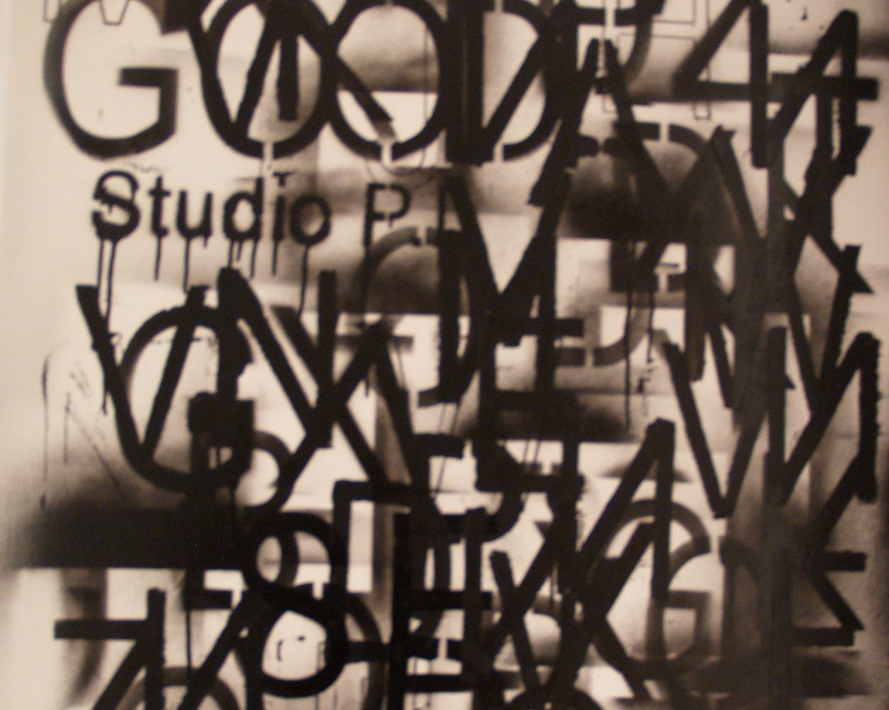
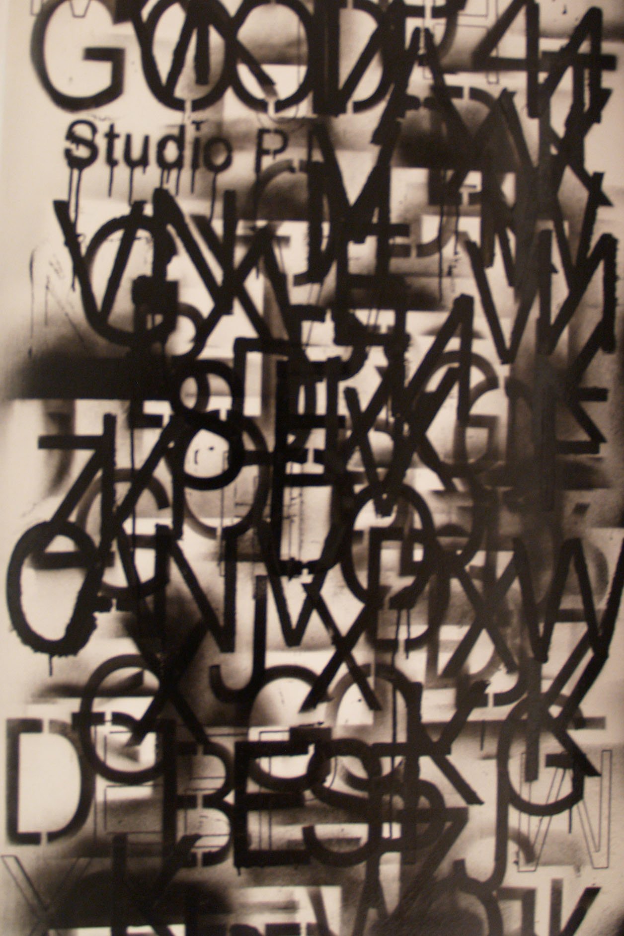
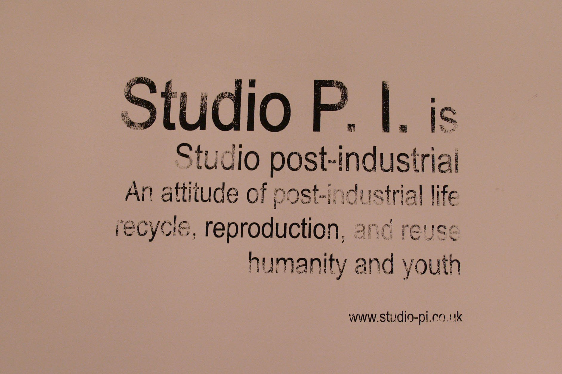
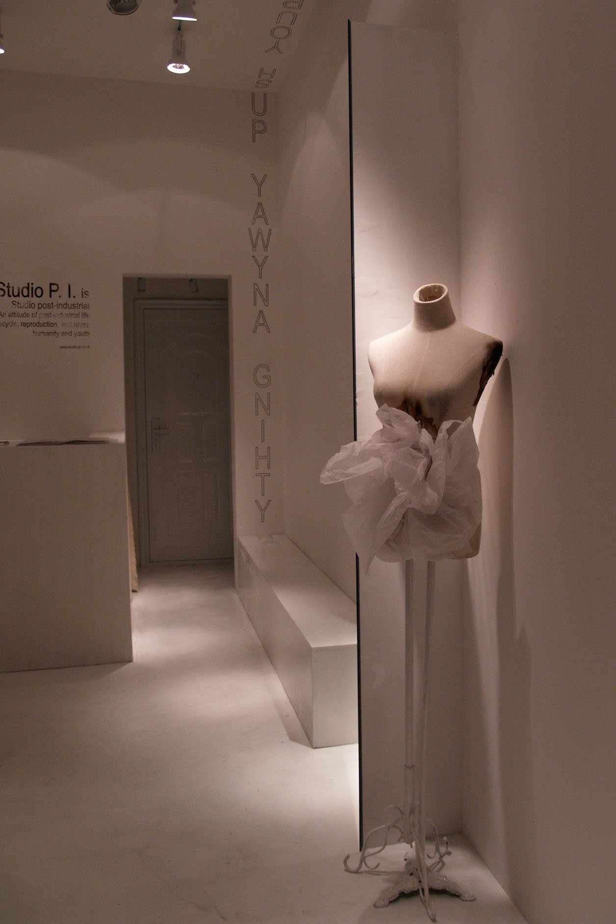
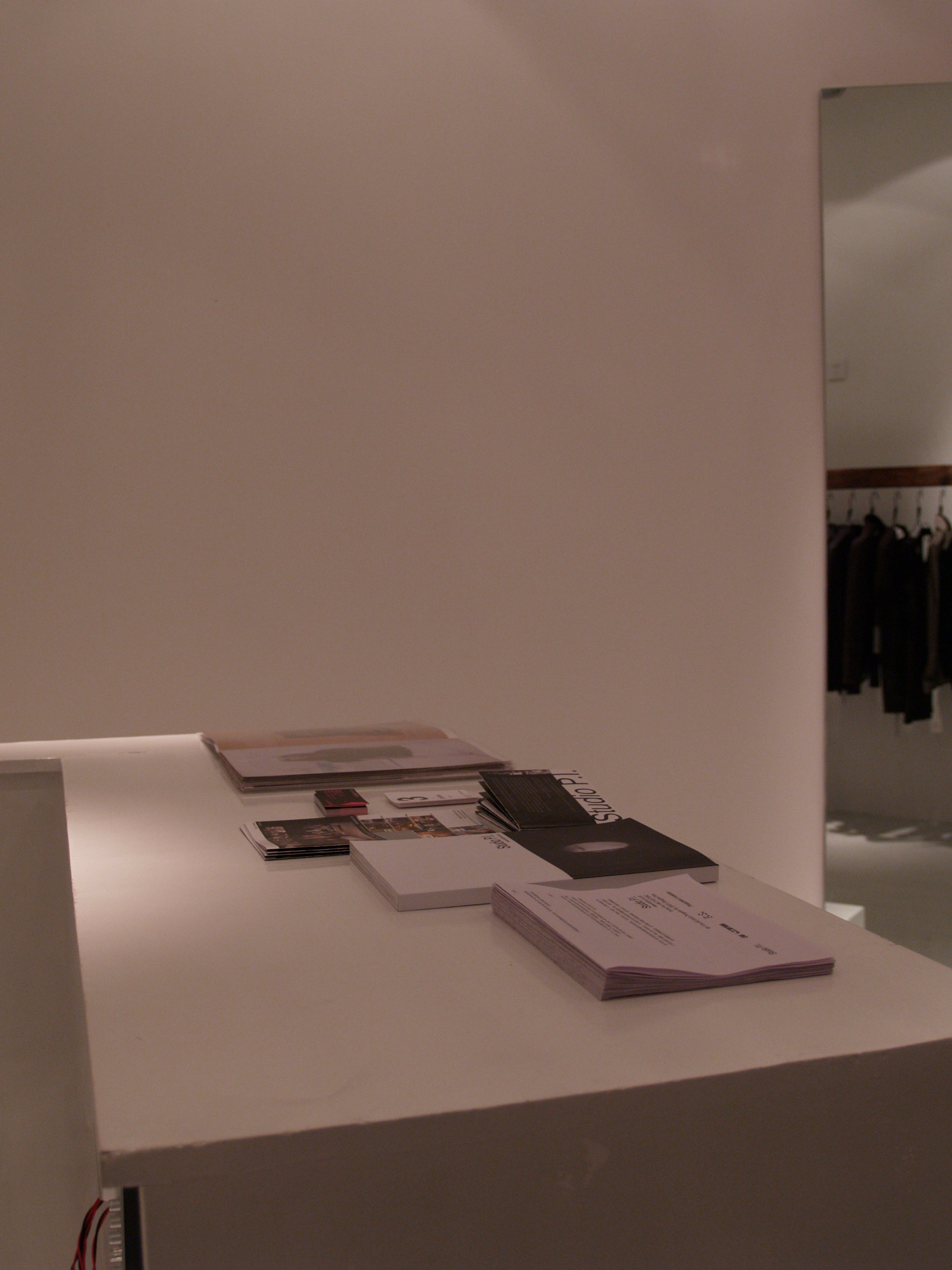
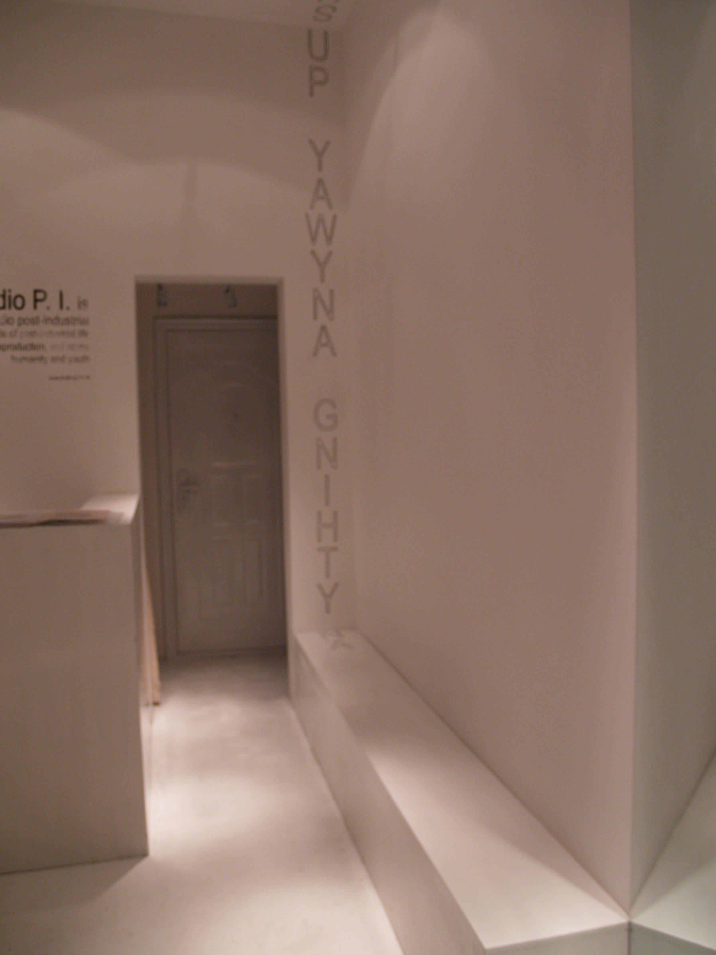
Choosing a serif or sans-serif typeface became a way to express a brand’s character. Across Studio P.I. and its showroom environments, consistent typography connected the logo, printed materials, displays and interiors. Stencilling, stamping and spray painting then gave those same letterforms different physical expressions. Graphic design became part of the space and the objects within it.
A notebook made from the workroom
One example was a series of gift notebooks. Their covers were made from discarded muslin used on ironing boards, retaining the iron marks and scorched traces of work. The team stamped the fabric with Studio P.I.’s logo, brand statement and slogan. A practical remnant became a printed object that carried the identity of the studio.
These notebooks belonged to the same visual world as the displays and interiors on the first floor of the flagship shop. The material, the lettering and the marks of use all helped connect a small handmade accessory to the larger brand environment.
3+VIP, graffiti and collaboration
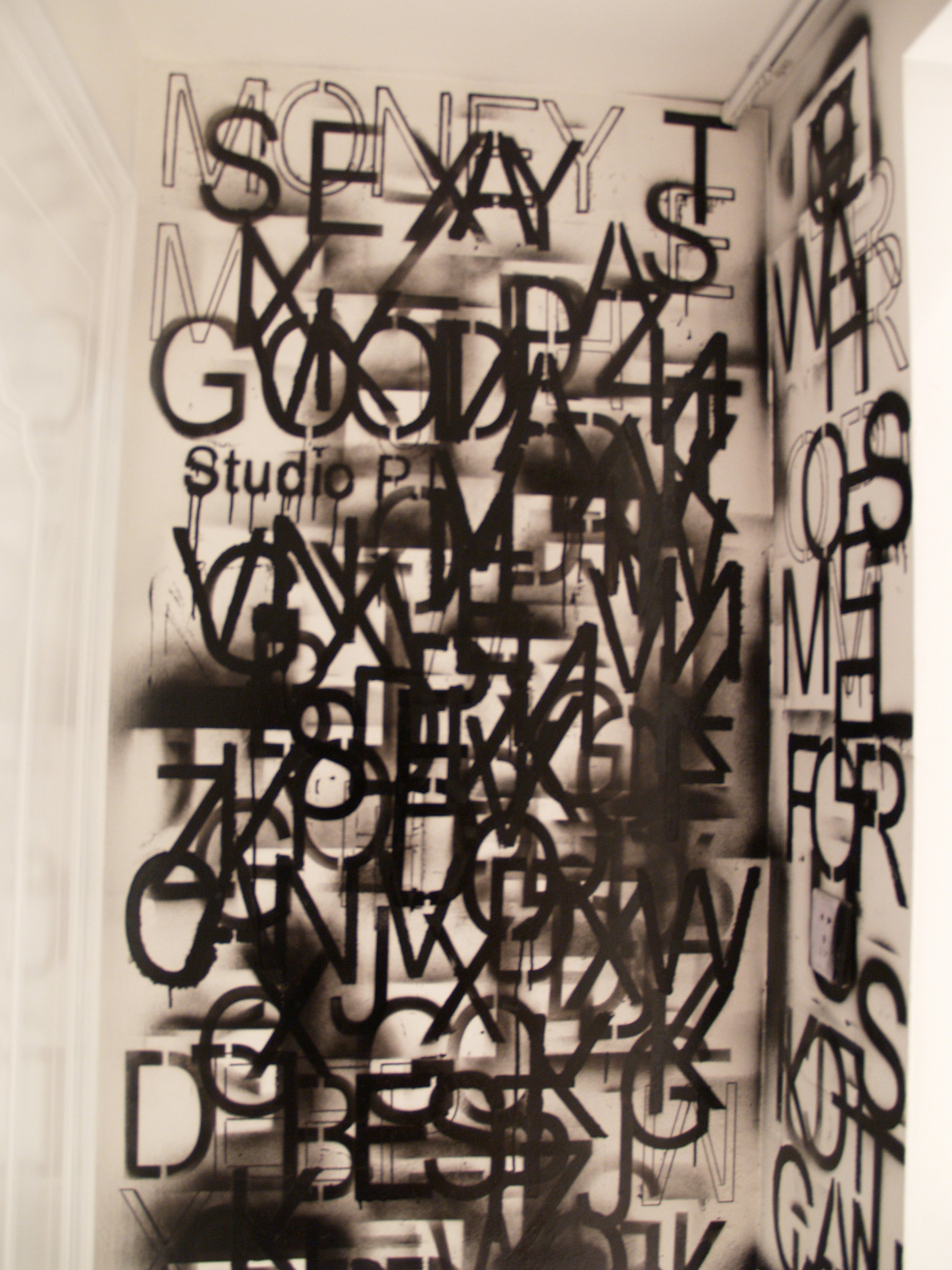
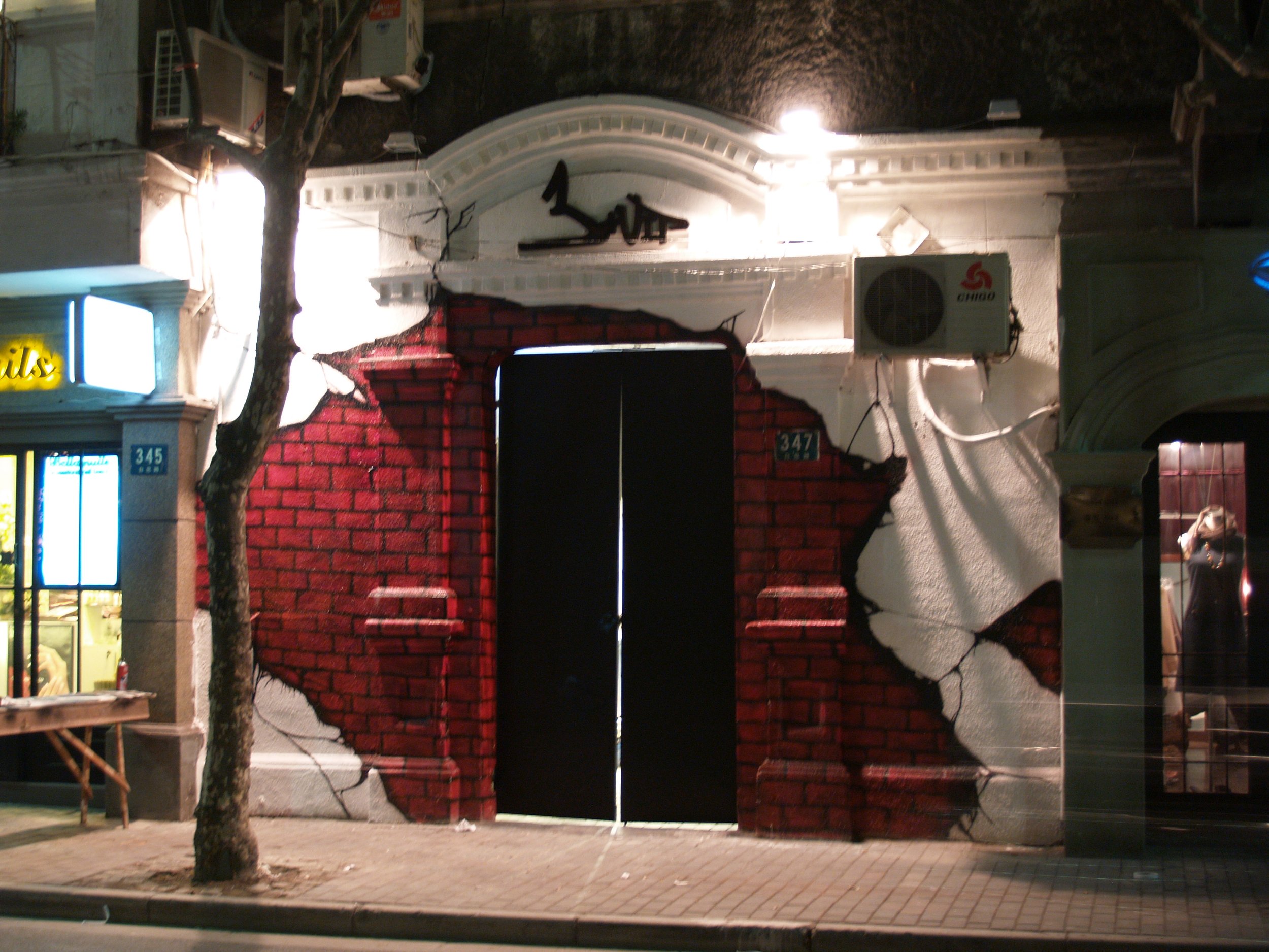
When someone suggested that the shop needed a more colourful alternative to its minimal black-and-white identity, she explored a younger, more vivid atmosphere for 3+VIP. Post-industrial materials remained part of the setting, while graffiti introduced another visual energy.
The studio collaborated with Whoops Crews, commissioning work for the store logo and hats associated with the brand and the shop. That collaboration also extended to the identity of RE:License, the conceptual collection built around upcycling.
RE:License: a name, a composition and a passport
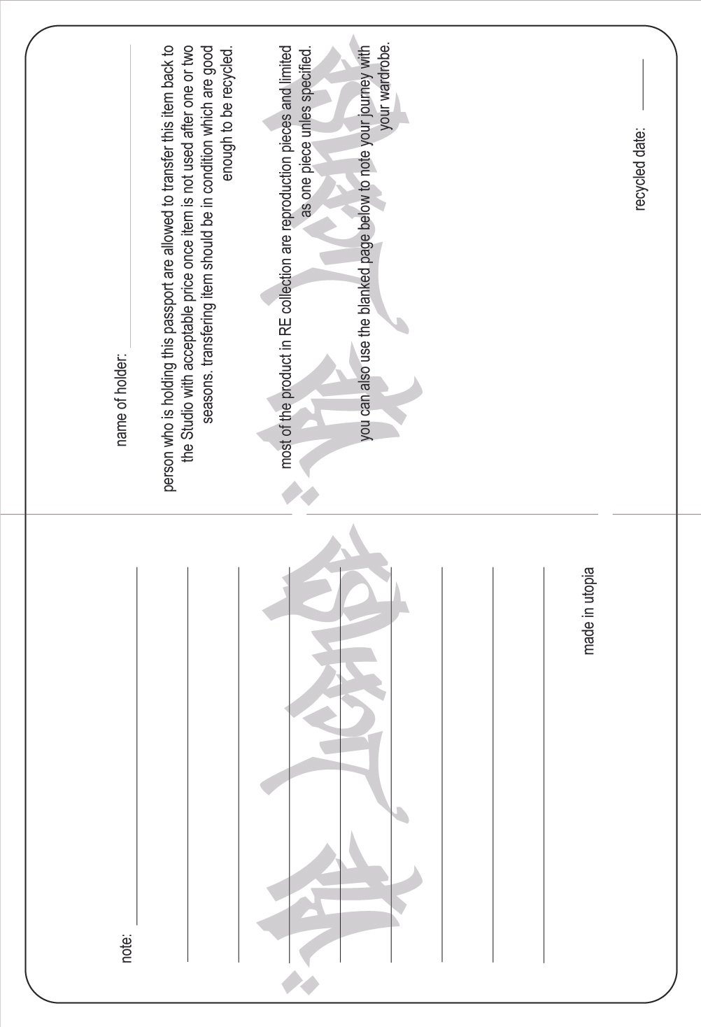
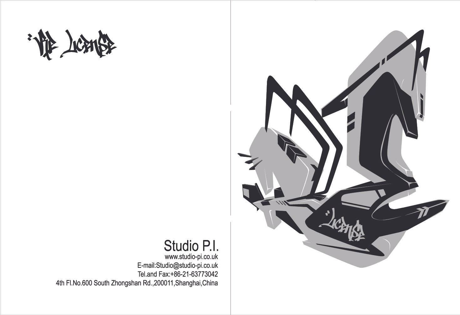
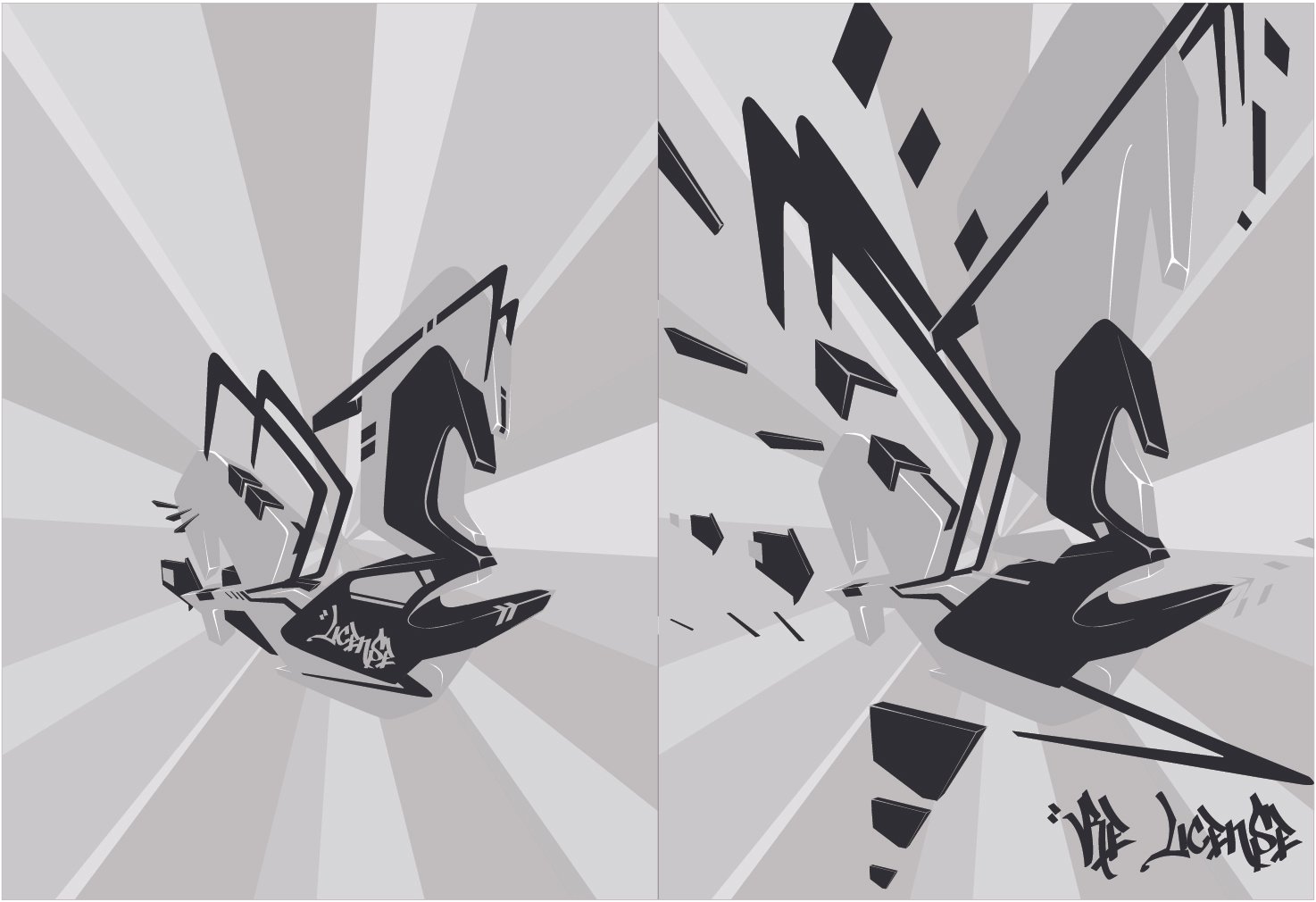
The RE:License graphics explored two ways of presenting the name. One treated the lettering as a written sequence; the other brought the letters together into a complete logo composition for the limited collection. The two graffiti interpretations played with collision, construction and deconstruction. On a flat surface, the forms suggested depth, movement and a three-dimensional logo coming apart and assembling again.
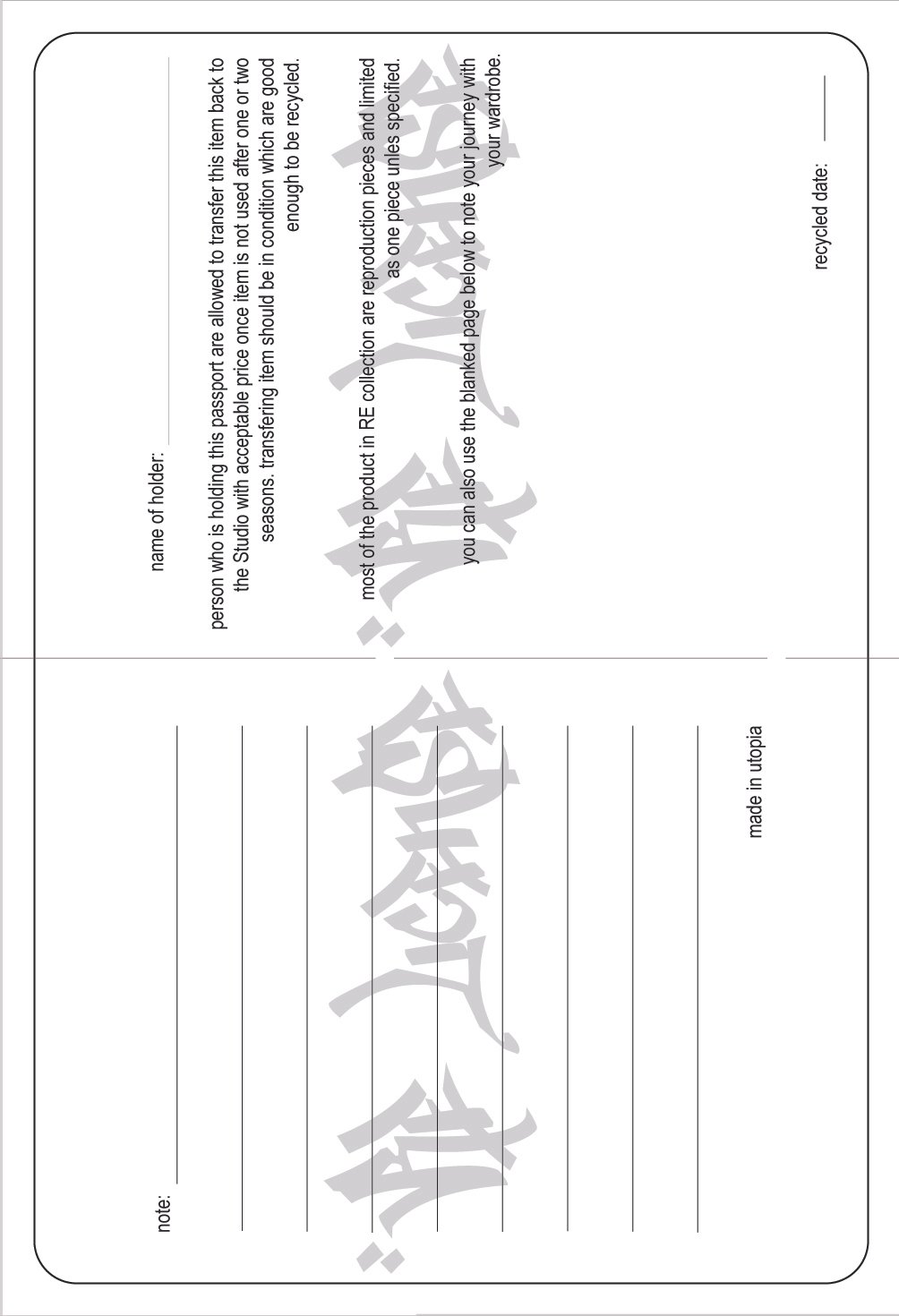
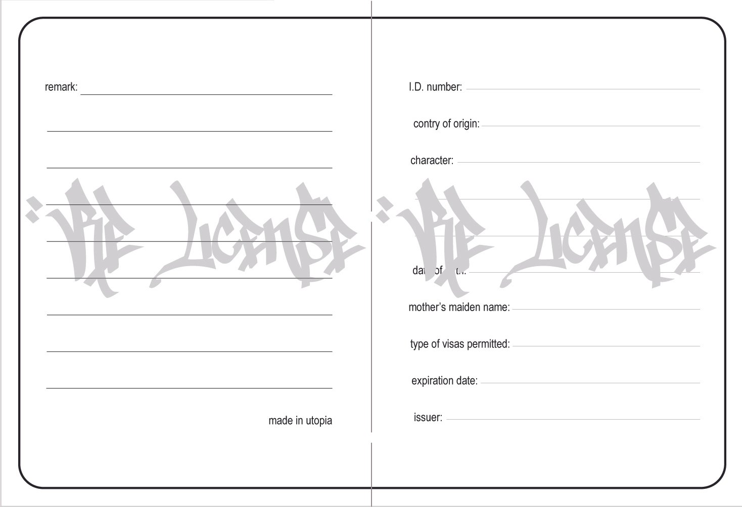
She carried that identity into individually numbered passports for the one-off upcycled pieces. Designed for a line that could run to hundreds of unique pieces across three shops, each passport gave its garment a distinct number and a collectible identity. The graphic work connected the collection’s name to the individual object.
Simple packaging and selective commissioning
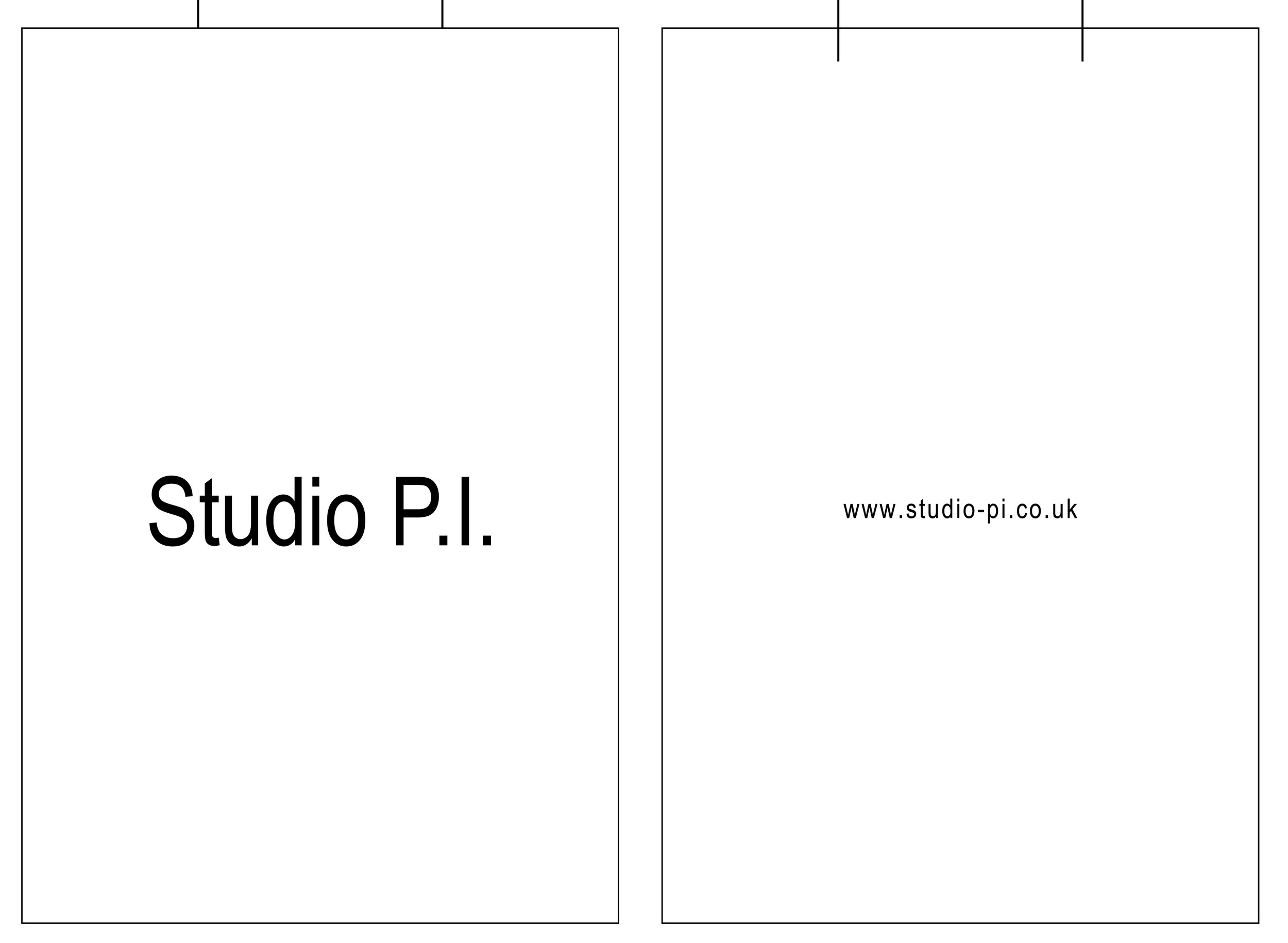
Two shopping-bag designs returned to a restrained format: white paper, a logo, the website address and a thin strap. They carried the same identity through simple materials and economical production.
Budget shaped much of the studio’s work, so the team often designed and made things themselves. Paid collaboration was also part of that approach. When a project called for skills beyond their own, they were willing to commission designers and artists whose ideas they valued. Shared understanding and mutual appreciation helped turn the branding, the spaces and the wider project into something they could realise together.
平面設計:從書寫到品牌的視覺語言
她對平面設計的理解,源於九十年代末至千禧年前後求學期間,對書法、字形與字體設計逐漸形成的興趣。繪畫、表面圖案設計與書寫,慢慢成為她創作中彼此相連的部分。一個字母既可以是可閱讀的符號,也可以是重複的紋樣、材料留下的動作痕跡,或品牌識別的起點。
從書寫工具重新理解線條
在意大利,她最初接受的是傳統學院式繪畫與素描訓練。其中一項練習,是以削尖的竹筆蘸墨,在素描紙上作畫。熟悉中國毛筆書寫的她,對這種差異感到新鮮:竹子可以作為柔軟尖頭毛筆的筆桿,也可以直接成為留下線條的硬質筆尖。筆尖改變了手的動作,也改變了線條的性格。
她亦對威尼斯的玻璃筆、金屬筆尖與較早的羽毛筆傳統產生興趣。這些觀察讓她開始比較不同文化中的書寫工具與材料,而不把書法理解為只屬於某一種媒介。在巴塞隆拿參觀 Joan Miró 的展覽時,她繼續留意繪畫、墨、動作與混合媒材之間的關係。
阿拉伯書法與重複紋樣
在巴黎 EFM 的學習中,一個關於室內表面的課程單元,涉及牆紙、牆磚、地磚及其他印花應用。她同時選修了阿拉伯書法延伸課程,被硬質筆尖所能產生的靈活、富有表情的線條吸引,並開始研究自己在中國、阿拉伯與西方書寫之間所看到的相似與差異。
這項研究亦讓她想到絲綢之路,以及商人、材料與觀念如何在亞洲、阿拉伯世界和歐洲之間流動。對她而言,這些路線提供了思考文化交流與相互影響的角度,也成為視覺研究的起點。
其中兩種阿拉伯書法風格尤其令她著迷。她開始把字形作為構圖元素,借鑑幾何裝飾中的重複、對稱與數學組織方式。她並不直接照搬幾何形狀,而是將書寫鏡像排列、平衡組合:2 × 2 成為四個單元,2 × 4 成為八個,4 × 4 成為十六個,8 × 8 成為六十四個。透過倍增與反射,文字可以轉化為表面紋樣。即使完成的圖案已不容易被立即辨認為書法,字形仍然是它的創作材料。
從字體走向品牌識別
她的興趣也延伸至二十世紀的藝術與設計,包括達達主義、風格派與包浩斯,以及後來在海報和文字藝術中運用語言的方式。她希望把這些組織圖像與文字的方法,帶入自己的設計與品牌構思。
選擇襯線或無襯線字體,成為表達品牌性格的一種方式。在 Studio P.I. 及其展示空間中,一致的字體把標誌、印刷品、陳列與室內設計連接起來。模板、印章與噴漆,則讓同樣的字形呈現不同的材料質感。平面設計因此成為空間與其中物件的一部分。
從工作室材料做成的筆記本
其中一個例子,是作為禮物製作的筆記本。封面使用燙衣板上退下來的白胚布,保留熨燙與焦灼的工作痕跡。團隊再以印章把 Studio P.I. 的標誌、品牌宣言與口號印在布上。原本實用的剩餘材料,成為帶有工作室識別的印刷物件。
這些筆記本與旗艦店一樓的陳列和室內設計,屬於同一個視覺世界。材料、字體與使用痕跡,讓一件小型手工配件也能延續整體的品牌氛圍。
3+VIP、塗鴉與合作
有人建議店舖需要一種更有色彩的面貌,不必一直維持極簡的黑白識別。她因而為 3+VIP 探索更年輕、鮮明而活躍的氛圍。後工業材料仍然構成空間的基礎,塗鴉則帶入另一種視覺能量。
工作室與 Whoops Crews 合作,委託他們參與店舖標誌,以及品牌和店舖帽款的設計。這種合作亦延伸到 RE:License——以升級再造為核心的概念系列——的品牌識別。
RE:License:名稱、構圖與作品護照
RE:License 的圖形探索了兩種呈現名稱的方式:一種把字母作為連續書寫的文字,另一種則將它們組合成限量系列的完整標誌。兩款塗鴉演繹在碰撞、建構與解構之間展開,在平面上營造出深度、動態,以及立體標誌拆散後重新組合的感覺。
她把這套識別延伸至獨一件升級再造服裝的作品護照。面對一個可涵蓋數以百計獨特設計、分佈於三間品牌店舖的系列,每件作品都獲發帶有獨立編號的護照,形成可收藏的個體身份。平面設計把系列名稱與每一件具體物件連接起來。
簡單包裝與有選擇的委託
兩款購物袋設計則回到克制的形式:白紙、標誌、網站地址與細帶,以簡單材料和經濟的製作方式延續品牌識別。
預算影響了工作室的許多決定,因此團隊經常自行設計與製作,也把付費合作視為這種做法的一部分。當一個項目需要超出自身能力的專業時,他們願意付費委託理念相近、作品受到欣賞的設計師與藝術家。共同的理解與相互欣賞,讓品牌、空間及整個項目的構想得以一起實現。
Studio P.I.

Web
Studio P.I|theutopium|UD2.0|LittleDesignSolution|BoekOverMij
Shoes & Accessories
Studio P.I.|ProjectComingOut